Start with a clean Excel table
Place one field name in each column header and one record on each following row. Avoid blank columns, merged cells, and manual subtotal rows. Convert the range to an Excel Table when possible so newly added records are easier to include later.
Insert a PivotTable
Select a cell in the source table and use Insert > PivotTable. Confirm the source range, choose where to put the table, and select the fields you want to summarize. Place a category in Rows, an optional second category in Columns, and a numeric field in Values.
Set the right aggregation
Excel often defaults to Sum for numeric fields. Change the Value Field Settings when you need Average, Count, or another calculation. A misleading aggregation can make an otherwise good chart answer the wrong question.
Insert the PivotChart
Click inside the PivotTable and select PivotChart from the PivotTable Analyze tab. Choose a clustered column chart for category comparisons, a line chart for time series, or another chart type that keeps the comparison clear. Use the connected field buttons to filter the result.
Refresh after changing source data
After adding or editing records, use Refresh on the PivotTable or PivotChart. If the source was not an Excel Table, verify the PivotTable source range also includes the new records.
Worked Excel example
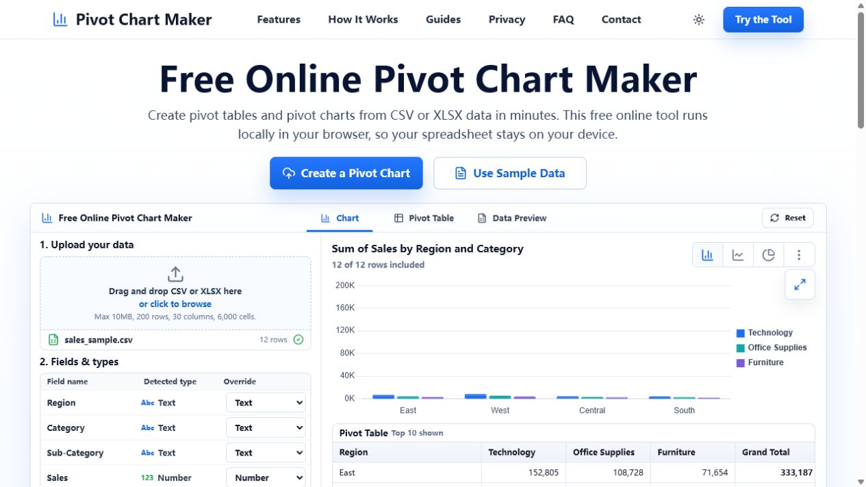
Download the retail sales CSV, open it in Excel, and convert it to a table. Put Region in Rows, Category in Columns, and Sales in Values. A clustered column PivotChart gives the same comparison shown below.
Download the example sales CSV · View the full example and expected result