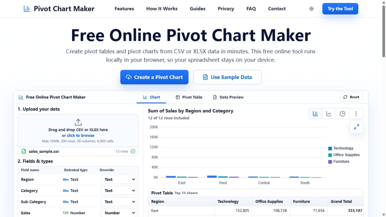
What a pivot table does
A pivot table groups records by one or more fields and calculates a value for each group. For example, it can show total sales by region and category. It is best when you need exact numbers, several levels of detail, or a compact summary that can be filtered.
What a pivot chart does
A pivot chart visualizes the result of a pivot table. It makes patterns easier to spot: which region leads, whether a measure changes over time, or which category makes up the largest share. Charts trade some precision for faster visual comparison.
When to use both
Most analysis benefits from both formats. Use the table to verify totals and inspect individual groups, then use the chart to communicate the main finding. Keep the table and chart aligned by using the same fields, filters, and aggregation.
Choose the chart after defining the question
For category comparisons, start with a bar chart. For a date-based trend, use a line chart. For a small number of parts of one whole, a pie chart can work. If a chart has too many categories or series, return to the pivot table and simplify the view.
See the difference in one sales example
The downloadable sales CSV becomes a pivot table of exact Region × Category totals and a clustered bar chart of the same totals. Use the table to verify the numbers, then use the chart to show which category leads in each region.
Download the example sales CSV · Explore the complete example