Download the example data
The CSV contains 12 sales records across four regions and three product categories. It is intentionally compact so you can inspect every source record before trusting the result.
Download the sales example CSV
Question answered
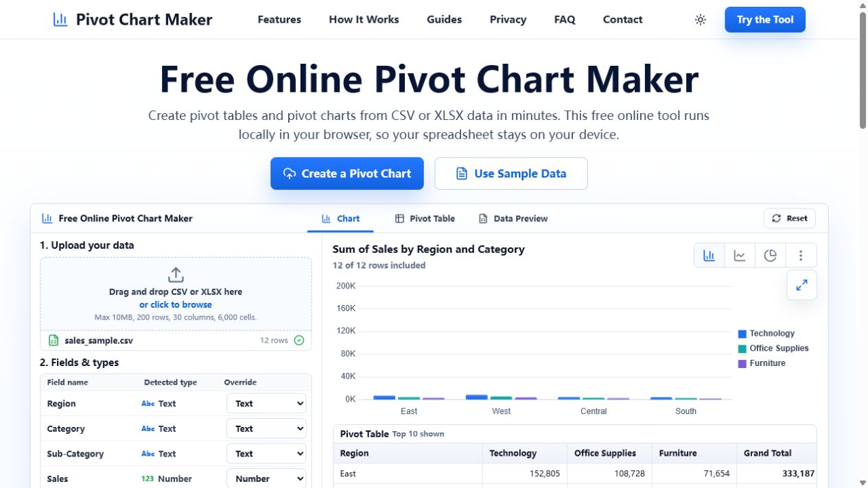
Which product category generated the most sales in each region? Create a pivot table with Region in Rows, Category in Columns, and Sales in Values using Sum. The resulting chart makes both the regional totals and category mix easy to compare.
How to read the result
Technology is the largest category in every region in this example. The West has the highest Technology sales, while the East has the largest overall total. Verify those conclusions in the pivot table before using the chart in a presentation.